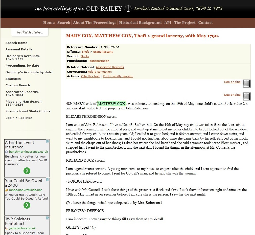
The Digital Panopticon project is linking together a wide variety of criminal justice, genealogical, and biometric records to trace thousands of convict lives from birth to death. Each story will start with a birth date anywhere from the mid eighteenth century to the mid nineteenth century, and will include a variety of events including convictions for minor offences, one or more Old Bailey trials and punishments, possible subsequent convictions, marriage, children, census records, and death. We are calling these life archives, though many will only present fragments of lives, depending on the amount of evidence available. One such fragment we have already assembled is that of John Davis, born in about 1817, convicted of stealing some clothes and other items from a dwelling house in 1836, incarcerated for a month on the hulks, and transported on the ship Moffatt to New South Wales, where he arrived several months later.
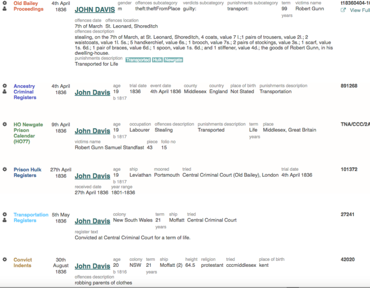
Life Archive for John Davis
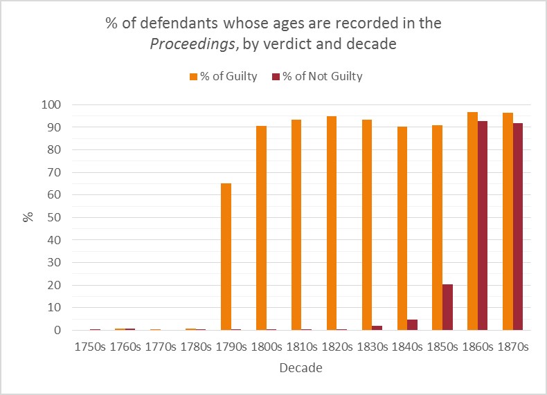
How do we summarise 100,000 stories like this? How can we find common patterns among all the individual narratives? The project is exploring a variety of visualisation techniques in order to summarise this evidence without, as much as possible, obscuring the complexity of the individual stories. We have already used visualisations to assess levels of missing evidence and detect errors in the Old Bailey Proceedings (Men as Wives: Visualising Errors in the Old Bailey Proceedings Data and Seeing Things Differently: Visualising Patterns of Data from the Old Bailey Proceedings), and to identify patterns in individual datasets (Transportation Under the Macroscope); and Open Data and the Digital Panopticon). But how do we use visualisations to document relations between datasets?
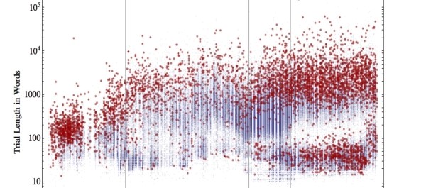
There is a bewildering array of visualisation formats available, as this Google Images screenshot indicates. Which one should we choose?

Which visualisation?!
The choice obviously depends on the nature of the information to be displayed. Our most successful record linkage so far is between the records of sentences (from the Old Bailey Proceedings) and the records of punishments experienced (primarily execution, transportation, and imprisonment). You may be surprised to read that there was a considerable discrepancy between the punishments judges dictated to convicts in the Old Bailey courtroom and the actual punishments they received. Following their sentences, many convicts received reduced punishments as a result of pardons, other decisions taken by penal officials, and ill health or death.
Most useful to us for representing these patterns are Sankey diagrams, which depict flows in many to many relationships. Individual lines trace individual journeys, but where the same paths are followed by many people they are brought together as thicker lines, the thickness of the line denoting the volume of the flow.
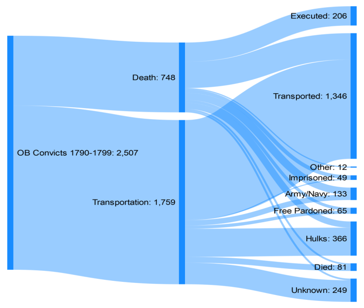
Old Bailey sentences vs actual penal outcomes, 1790-99
For example, this diagram traces the convicts’ experiences in the 1790s, focusing on the two main sentences of that decade, death and transportation. We can see from this that only a proportion (28%) of those sentenced to death were actually executed, with many others being transported (following a conditional pardon), and a few experiencing other outcomes such as going into service in the army or navy (during the French wars) or death. Only around two-thirds of those sentenced to transportation, similarly, were actually transported, with the remained ending up in the hulks (and then presumably discharged after a period), or having a small number of other outcomes.
The advantage of presenting the information in this way—as opposed to, for example, a table—is that it is readily understandable without obscuring the variety of the possible outcomes. Moreover, the patterns which stand out pose questions for further research, such as how and why did so many potential transportees manage to evade this punishment–and what determined which punishments they actually received? These are issues we are currently investigating.
But what happens when the variables become more complex, and the number of stages prisoners might go through multiplies? This is the problem we are working on now. As noted, our multiple datasets include information about a variety of different types of events in convict lives. Sankey diagrams should be able to help, as they can show multiple paths through several stages, which is what we want to do with convict lives. Each life history can be a line in a Sankey diagram, which, when 1000s of lives are included, would reveal general patterns. But how do we manage the large number of events, taking place at different times? A problem here is that we want to introduce a time element to the variables (the actual dates of events), which makes it too complicated for a normal Sankey diagram.
There is no off-the-peg solution to this problem. But here is a crude mock up using Excel of what we hope to achieve. Eventually we will develop visualisations like this using D3, a JavaScript library for producing data visualisations.

Twenty-four convict lives from birth to punishment
This is based on twenty-four convict lives where we currently have eight or more records, including their birth, previous conviction (if any), Old Bailey conviction, and punishment (periods of incarceration in the hulks or a prison and subsequent release, or transportation, or execution).
It is hard to draw conclusions from the rather inelegant presentation, but you can start to see some interesting patterns. A flat line means little time elapsed, while a steep line connotes a longer period. We can see how many convicts had previous convictions, and how these often occurred years before the Old Bailey conviction which led to the punishment displayed. In terms of punishment, we can see significant changes over time in the nineteenth century: crudely a shift from incarceration in the hulks followed by transportation; to prisons followed by transportation; to prisons leading to a prison licence. What will happen when we replicate this format with tens of thousands of cases? Will patterns become clearer, or will it just be a mess?

Convict lives by age at which events occurred
In fact, this visualization is in some respects already too complicated to interpret easily. If we remove the date variable and just use the age at which events occurred, it simplifies things. Here different patterns emerge: the wide age range of previous convictions (many first convictions took place at a young age), the wide age range of those convicted at the Old Bailey; the relatively short time gaps between conviction and commitment on the hulks, and between incarceration on the hulks and transportation (usually); the longer times spent in prison before transportation or licence; and the older ages of those sentenced to prison.
Obviously, this is work in progress, and we have a lot more work to do to create accessible and fine-tuned visualisations providing these types of information, while including thousands more cases. We hope that what we come up with will be of use not only to this project, but also to researchers in other fields who want to create visual representations of vast amounts of complex data in accessible formats.