Category Archives: Themes

Adventures with Data Linkage

The British Convict Transportation Registers is a database detailing the journeys of over 123,000 people transported to Australia in the 18th and 19th centuries. Compiled from British Home Office records, it contains information such as the name of each person being transported, the date they departed, and their final destination.

The early stages of the Digital Panopticon have allowed us to perform some preliminary data linkage between these registers and people sentenced to transportation in the Old Bailey Proceedings. We’ve made the links primarily by name, with a degree of tolerance for spelling. We found that many names actually matched exactly, suggesting that perhaps names were in some cases directly copied from one record to another. A further 7% of names could be matched via an algorithm known as Soundex, which attempts to identify names which sound similar when spoken, but might be (accidentally) spelt differently. A remaining handful were matched by virtue of having a small Levenshtein Distance. Levenshtein is a simple metric by which the variance between two text strings is quantified. Including matches with a very small Levenshtein Distance, where perhaps only a single letter is different or omitted, helps take account of minor clerical errors.

Percentages of names matched between the British Transportation Records and Old Bailey Proceedings, under various conditions.

Results of attempted name matching between the British Transportation Records and Old Bailey Proceedings.

In total, about 70% of the people sentenced to transportation in the Proceedings appear in the transportation records. We can be quite confident of about half of these, because in some cases the date of conviction is actually given in the transportation record. If the date and name match, it becomes very likely that we’re dealing with the same individual. For transportation records where a conviction date is not given, we have to examine five or six years worth of Old Bailey records to make sure we don’t miss a possible match. This greatly increases the possibility of a false positive, so we can be less sure about these links.

One interesting trend is that the number of exact links decreases significantly in cases where the conviction date is not given. A greater proportion of these links had to be made with Soundex or Levenshtein Distance. This suggests that the links made without a conviction date are less reliable, as we might expect. Therefore, for the time being we will discard these.

With our most reliable links in hand, we can begin looking for patterns between the details of conviction and transportation. One of the most interesting pieces of information contained in the transportation records is the destination of convict ships. An obvious question is whether convicts were directed to particular destinations based upon their offence, gender or age. One might imagine colonies having a need for people with particular skills or attributes at particular times, and the system might have attempted to address these needs. Luckily, occupation is indeed sporadically recorded in the Old Bailey Proceedings.

In fact, the data shows that the overwhelming factor in deciding where a convict was sent was the particular year when they left England. Transportation was almost exclusively to New South Wales before 1831, and overwhelmingly to Van Diemens Land after 1838. There is a brief period from 1832 to 1835 where roughly equal numbers of convicts are sent to both destinations. However, even during that period, there doesn’t appear to be any correlation between the characteristics of a convict and their destination. Neither gender or age, crime or occupation seem to have made any difference. Once a person was in the transportation system, their final destination was entirely arbitrary. There was no easily identifiable tendency to send people with particular attributes to particular destinations.

Sankey diagram, showing proportions of different age groups transported to different destinations, including where the destination is unknown because a link between records could not be made.

Sankey diagram, showing proportions of different age groups transported to different destinations between 1832 and 1835, including where the destination is unknown because a link between records could not be made.

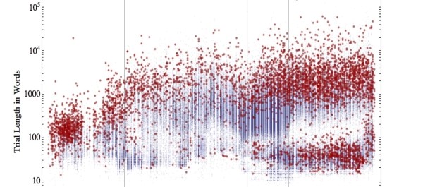
If we cannot find a pattern in where people were sent, perhaps we can find a pattern in how long it took them to be sent there. For every convict there is a period of time between when they were convicted and when they actually set sail aboard a ship. The interval between conviction and transportation is hugely variable. A few people were transported in little over a month. Some people, as we have noted, spent six years waiting to be transported.

Line graph showing the minimum, maximum and average intervals between conviction and transportation over time, 1787 - 1852.

Line graph showing the minimum, maximum and average intervals between conviction and transportation between 1787 and 1852.

The data shows that again, time was a very important factor. Transportation almost halted between 1835 and 1844, as did sentences of transportation. In contrast, the system seems to have been at peak efficiency between about 1814 and 1834, but even then there are a few outliers (represented by the green line) who still had to wait a very long time to be transported.

Detail of a scatterplot variation showing every interval between Proceedings conviction and BTR transporation, represented by horizontal bars running from conviction date to transportation date. Females are blue, males are orange.

Detail of a scatterplot variation showing every interval between Proceedings conviction and BTR transporation, represented by horizontal bars running from conviction date to transportation date. Females are blue, males are orange.

If we look at the data in more detail, we can see that a great many of those sentenced to transportation, at least early in the period, are simply waiting for the next boat to depart. Convicts sentenced at multiple sessions are stored up until, presumably, there are enough to justify a voyage. Nevertheless, there are people who seem to miss multiple voyages; people convicted at the same session as those who depart on the next boat who are, for whatever reason, left behind. Can we detect any common characteristics among these people?

It is not at all easy to find a pattern, but there may be one: Male prisoners below the age of 15 appear to be kept for longer, on average, than those who are older. It’s worth noting that the minimum and maximum intervals show no such trend; there are still people under fifteen who are transported very quickly, and people over fifteen who are held for a very long time. But in terms of the average, there is a definite increase which starts abruptly at the age of fifteen and then accelerates as prisoners get younger. In fact, on average, male prisoners under fifteen are kept for twice as long as those over fifteen.

Age plotted against minimum, maximum and average days between conviction and transportation, for males sentenced at the Old Bailey 1787-1852.

Age plotted against minimum, maximum and average days between conviction and transportation, for males sentenced at the Old Bailey 1787-1852.

This is a finding which we can begin to investigate and verify. Certainly, the pattern is not repeated for female prisoners, whose average transportation time remains remarkably consistent regardless of age. As the project gathers more data and continues its initial investigations, we hope to be able to explore this possible trend in more detail.

This is the very first linking exercise we have done, and there is undoubtedly scope to refine the process. Every dataset we add will help us to evaluate our findings more thoroughly and ask more detailed questions. The next step may be to try and link the Old Bailey and Transportation Registers to the Convict Database, which contains information such as height, and prisoner health. These may well be important factors in determining the treatment of prisoners and providing further clues as to the nature of a journey through the eighteenth century criminal justice system.

Visualising Life-Grids and Narrating the Lives of Convicts

One of the great opportunities presented by the Digital Panopticon project (and one of the most exciting in my opinion) is in uncovering more about the processes of crime and punishment by placing thousands of offenders, and their offences, back within the context of their own lives.

Tracing offenders through the records has been a preoccupation of several groups of historians and criminologists (for example Barry Godfrey, Heather Shore, Pam Cox, David Cox, Helen Johnston, Zoe Alker, Joanne Turner, and Stephen Farrall) in the last decade. On account of the laborious nature of record linkage those studies which have focussed on tracing groups offenders through civil as well as criminal datasets have been able to examine a few hundred offenders at a time. Those pioneering this methodology have taken the collected information and sorted it into ‘lifegrids’ which chart life events and changes for each individual. Lifegrids might typically include details of birth marriage and death, family evolution, employment and residential addresses, and offending and punishment history. Of course, the depth and breadth of documents and information available on different groups of, or individual offenders, dictates how much material can be recorded in each life grid.

Other than life-grid format, there are a number of ways that this information can be presented and communicated. Even the simplest visualisations are able to show the role that offending had in any one person’s life. This might be through indicating what proportion of an individual’s life was spent in custody, or how many offences were recorded against them at what stage of their life. It is possible to chart how someone’s offending accelerated and decelerated. From an institutional perspective it is possible to indicate how an individual’s weight and health changed over time, or how their behaviour and privileges impacted upon their experience of punishment. The myriad of ways in which this fascinating and complex data can be presented has some exciting potential for how others see, interrogate, and engage with this fantastically rich data.

To begin to explore these possibilities, we have been working with an example offender: Patrick Madden (one of a number of offenders included in Johnston, Godfrey and Cox’s ESRC funded research on ‘The costs of imprisonment’).

P Madden

Born and raised in Sheffield, Patrick began offending around the age of sixteen. Although often motivated by property, Patrick’s offences were primarily violent in nature. Madden had 15 offences recorded against him over an almost thirty year period. Each of these was committed either in Sheffield or other close-by northern towns such as Wakefield and Doncaster. It was in these locations that he was incarcerated, accept for one occasion of penal servitude when he served seven years of penal servitude in London, and the south of England. It does not appear as if Patrick ever married or had children, nor that he managed to establish a life for himself that did not involve repeat offending for long before dying at the age of 52.


Patrick Maddens lifegrid, of course, contains much more information than this brief overview might suggest. Patrick’s civil and penal records allow us to know about many elements of Patrick’s life right down to his familial relationships and sexual preferences. However, even if we take the most ‘bare bones’ approach to Patrick’s life narrative, it is possible to start creating some interesting visualisations based on his experiences and offending history.

DataHero Patrick Madden years of imprisonment in life course (1) DataHero Patrick Madden type of offending over life course


DataHero Weight over period of imprisonment line DataHero Penal class over time of imprisonment


Yet the size and scale of the research being undertaken by the Digital Panopticon means that we are faced not just with presenting Patrick Madden’s life, but instead the lives of all of the ‘Patricks’ that went through the old bailey between the late 18th and early 20th centuries. This poses two distinct challenges which we will face in presenting the mass of information traditionally held in lifegrids.  First is that the range of records being linked together for each offender is unprecedented. Some records are well known to our researchers and relatively straightforward to visualise, such as criminal registers that allow us to examine date, place and type of offence. Others such as the changing picture of family life that might evolve from three successive census entries, or the seemingly random personal or professional information that can be carried in a newspaper report, are far more difficult to quantify and visualise. This first problem will become clearer and hopefully less significant as more records are collected and linked. It should be fairly straightforward to identify the information which can be presented easily, and to adapt that which cannot. The second challenges we must meet is that of potentially presenting to other researchers and the public tens of thousands of individual life and offending histories. What we need to work on is finding a way of presenting a range of different information about our offenders both individually and in aggregate so that it is possible for users to access information about an individual they are interested in, but also to see how such an individual compares and contrasts with others in the study – something which enables researchers to identify how typical an individual’s experience was.

BG offered some initial ideas of how we might best achieve this when we met in Oxford. By creating ‘strand’ visualisations which present a mass of offenders by a few ‘key values’ –  for example the year of their first recorded offence, nature of offence, or length of offending career – and then allowing users to further restrict what strands are shown to them by other values – for example sex and location- it would be possible to access information about a single individual, whilst getting a sense of how they match up to their contemporaries.

BG visualisation

We hope that this will prove an excellent starting point as we work to develop future visualisations and methods of presentation which will allow the Digital Panopticon team, fellow researchers, and members of the public to explore, understand, and get the most from the fantastic wealth of data at our fingertips.


Visualising Data Workshop Report: part 2

The second half of the workshop was devoted to work in progress and plans for the Digital Panopticon – I’ll say less about these than those in part 1 because longer versions should be appearing (or have already appeared) here on the blog!

Barry Godfrey briefly introduced the project and the challenges of visualisation of our data.

  • we’re looking at systematic changes in punishment over a long period of time (late 18th to early 20th century); but we’re also looking at individuals over their lifetimes and at many thousands of individuals.
  • It’s not just about temporality: we’re also deeply concerned with spatiality – not simply the long distance movement of transportation but movement within Britain.
  • another theme of the project is ethical – the responsibilities of revealing so much information about people: how much does this extend to visualisation too?
  • finally, there are many potential audiences for DP data visualisation – in addition to researchers and academics, students, teachers, genealogists and other non-traditional users of criminal data. How to cater for so many different people and their needs?

Jamie McLaughlin demonstrated some of our early explorations in record linkage and data visualisation, including a number of Sankey diagrams to show connections between two datasets (Old Bailey Proceedings and British Convict Transportation Register). In particular, he’s been comparing the outcomes for defendants sentenced to transportation and those who were sentenced to death which was subsequently commuted to transportation. Another topic of interest is the people sentenced to be transported who don’t subsequently turn up in the transportation records: what happened to them? Can we find them again elsewhere?

Richard Ward focused on visualising (again, extensively using Tableau Public)  a single dataset, the Proceedings, and covering much of the ground on questions of age in his recent blog post here(I learned along the way that the proper demographic term for the tendency to round ages is age heaping.) He also introduced the topic of occupations/status labels – which are problematic in the Proceedings for a number of reasons – and hopefully this will be covered in his next blog post. [slides]

Barry and Lucy Williams rounded off the session by looking at the challenges involved in visualising life grids. Barry’s previous research on 600 prisoners used a wealth of different sources including licenses, medical sources, and other prison records, as well as civil data, and tried to build up as complete a picture as possible of each prisoner’s whole life: this was summarised in life grids. We looked at interesting options for visualising the life of a single prisoner – but how to multiply up to thousands of them? [blog post]

The following discussion introduced a number of suggestions and possible ideas and resources to follow up. Certain themes however, resurfaced throughout the day as key issues:

The importance of seeing data visualisations as part of a process with changing needs and purposes over the course of the project, and for different people. Part of the challenge is that we want to cater not just for the specific research agendas of the project team members but also for a range of other researchers.

The twin challenges of scaling up and the very long period of time we’re covering; but also the sheer variety of different types of source and data that we’re dealing with. The Proceedings are a very different kind of record from the (mostly) highly structured tabular data of Founders and Survivors, and from the English imprisonment records we’ll be working with.

It was all in all a great day! We were bowled over by the wealth of ideas from our three external speakers and the additional input of everyone who attended for the day, not least Andrew Prescott: thanks to everyone who came for making it such an enjoyable and stimulating event. And I’d add a final thank you to Deb Oxley for organising the event and being a splendid host.

Visualising Data Workshop Report: part 1

The first half of the workshop consisted of speakers we invited to introduce the ways in which they have used visualisation in research, and look at how these could be useful to the Digital Panopticon and researchers attending the event. I’ve included as many links to relevant resources as I could find. (See also the Storify of the event.)

Professor Min Chen of the Oxford e-Research Centre got the day off to a great start. He treated us to a dizzying array of examples of different kinds of visualisations, emphasising the importance of who visualisations are being created for. He surveyed the long history of data visualisation and outlined four levels of visualisation:

  1. disseminative (‘this is’) – presentational aids for dissemination
  2. operational (‘what?’) – enable intuitive and speedy observation of captured data
  3. analytical (‘why?’) – investigative, can be used to examine complex relationships
  4. inventive (‘how?’) – aid improving existing models, methods etc

He also got us to think about ‘modes’ of visualisation, the different perspectives/needs of analysts, presenters and viewers. Question asked: ‘what would be a visual language for the Digital Panopticon?’ – taking into account the different kinds of data we’re working with.

These were just some of the examples!

  • Poem Viewer from the Imagery Lenses for Visualizing Text Corpora project (Oxford and Utah collaboration) – designed to support close reading by visualising the sounds of poetry.
  • Temporal Visualization of Boundary-based Geo-information Using Radial Projection – visualising movement of 200 glaciers over 10 years (recorded in satellite images). This was highly challenging: line graphs were too messy, maps not very helpful; a solution was found in radial visualizations.
  • Visualizing facial dynamics – humans are very good at expression recognition, but computers are terrible; project investigating methods to do this
  • Use of glyphs (simple stylised icons) rather than text labels in complex workflow diagrams, and to enable display of multiple measurements simultaneously.
  • Idea of parallel coordinates for visualising multi-dimensional data. (Lots of interest in this!)
  • How to visualise time without animation? – summarising into a single picture can help to see patterns.

Next, William Allen of the Oxford Migration Observatory talked about ‘Doing the Best with Data: critical realism and visualisation’. The Observatory’s goals are to communicate social science research beyond academia; migration is complex and doing this accessibly is challenging, so they make extensive use of visual techniques.

Visualisations are appealing, as they appear to offer comprehensive and independent windows, but actually achieving this needs to approach visualisation as an iterative and critical process. Use of critical realism approach as a lens for evaluation, critical testing of given categories. Rather than ‘what works?’ it’s better to ask ‘what about this visualisation works, for whom in which contexts, for what purposes?’

The media monitoring project was set up to monitor and analyse systematically what the press actually say about migration, over a period of time. Analysis of how press portrays migrant groups uses corpus linguistic methods (43 million words for 2010-12!). Allen showed us a number of visualisations using the tool Tableau Public (which some members of DP team have also been using).

Allen spoke of the ‘frontiers of visualisation’

  • political: how data/research are used by range of actors, decisions made through research
  • technical: the software and built-in assumptions/settings
  • virtual: interactivity, challenges of opening analysis up to public stakeholders

Questions and problems arising from the Observatory’s work: how do we visualise large datasets and patterns in them? Every decision comes with assumptions about what works. Also emphaised the danger that visualisation software can be a black box – eg, misleading on scale.

Additional resource: The Observatory website has a terrific page of data and resources with ‘ready-made charts and maps on migration in the UK as well as a description of key data sources and their limitations’, and a create your own chart facility. Go and play!

Our third speaker, Arthur Downing (Oxford), gave a presentation on Network Analysis and Visualisation for historians.

A network is a particular set of connections between agents: network analysis is analysis of the patterns of these connections (‘nodes’ and ‘links’). It differs from standard social science methodology (which tend to chop up objects by categories like race and gender and then looks at averages), in that network analysis starts with connections between objects/actors and then looks at their attributes. This is important because there can be different patterns of connections within superficially similar scenarios.

Some fascinating case studies he introduced:

Downing’s own work on 19th-century Friendly Societies – a network analysis of proposers and seconders showed that top 20% of recruiters were responsible for 80% of members. But using ‘eigenvector centrality’ (which takes into account degree of node and degree of nodes connected to each node), also showed that some people were important even though they weren’t large recruiters.

Network analysis for maps can show more complex patterns than standard maps:

  • Spread of Freemasons in the US – on a conventional map this just looks like a ‘frontier’ movement, but when mapped as a network, a  different picture emerges with more complex directions of flows
  • Social networks between Australian lodges – most migration is short distance and internal, though migration from England and Wales is very important

Pitfalls and problems:

  • identifying the boundaries of networks can be difficult
  • sampling is hard to justify as any missing ties can skew interpretation
  • longitudinal analysis is difficult – network analysis by definition is a snapshot in time; but may want to know how long does a tie persist. One answer is to breaks down into phases and look at different periods

Conceptually this is very different to standard statistics: ‘analysis of an endogenous system where endogeneity is what is interesting’, but potentially a great method for social history since it’s all about exploring complexity.

In subsequent discussion, concerns about ideological assumptions going into visualisations and how to communicate them to the user – but a reminder that this is a problem with traditional charts and tables too, with no simple answer.

We were deeply grateful to all three speakers for providing us with so much food for thought, and so many ideas to follow up!

[Part 2 of the report to follow shortly…]

Seeing things differently: Visualizing patterns of data from the Old Bailey Proceedings

An OBP

An edition of the Old Bailey Proceedings

The Old Bailey Proceedings are a rich historical resource, almost unimaginably so. They constitute the largest body of texts detailing the lives of non-elite people ever published. Words alone can’t quite do justice to the magnitude of the Proceedings – 197,745 accounts of trials covering 239 years (1674-1913); some 127 million words of text (at an average reading rate of 250 words per minute, this would take eight hours’ solid reading every single day for nearly three years to get through!); details of some 253,382 defendants, including name, gender, age and occupation, as well as details of 223,246 verdicts passed by the juries and 169,243 punishments sentenced by the judges.

The Proceedings clearly contain a huge amount of information, but they don’t record everything – like any historical source, they are selective in what they document. The amount of information that was recorded in the Proceedings on crimes, verdicts, punishments, defendants and so on also varied over time. And whilst the digitization of the Proceedings by The Old Bailey Online has revolutionised the way in which we search and use this rich historical resource, this also has its limits. The marking-up of the text of the Proceedings (assigning tags to particular pieces of information in the text – such as name or crime – so that this information can be systematically searched) makes it possible to undertake sophisticated statistical analysis. Crimes, verdicts, punishments, defendant age and defendant gender can all be counted at the click of a mouse. Nevertheless, marking-up inevitably involves choices (about what information to tag and the level of detail that is tagged), and those choices limit the ways in which the Proceedings can be studied using computers.

Statistical searches of the Proceedings can be carried out through The Old Bailey Online

Statistical searches of the Proceedings can be carried out through The Old Bailey Online

The question that we might ask, then, is what are the limitations of the Proceedings as a source of data on such things as punishments, defendant age and gender? Taking the Proceedings in their entirety, what are the limits in terms of the information that was recorded in the original trial reports? How frequently, for example, was the age of the defendant recorded? And what are the limits in terms of what we can actually search for systematically using digital technologies? Can we, for instance, systematically determine the lengths of imprisonment which offenders were sentenced to?

These are crucial questions for us because the Digital Panopticon will rely so heavily on the Proceedings as a source: in our effort to trace the life histories of offenders who were sentenced to transportation or imprisonment at the Old Bailey between 1787 and 1875, the Proceedings will obviously be a vital source of information. After identifying those who were sentenced to transportation or imprisonment recorded in the Proceedings we will then try to trace such individuals both before and after their conviction by linking the Proceedings with other sets of records.

In trying to better understand the limitations of the Proceedings as a source of data for the Digital Panopticon project, I have recently been making use of data visualization (‘dataviz’) – using computers to create visual representations of numbers. This includes the traditional graphs and pie charts that we are all familiar with, and which I will be talking about here. But it also includes more complex forms of visualization which I will be looking at in future posts (watch this space!).

Since the Proceedings contain such a vast amount of information, manual counting and tables are therefore inadequate in making sense of the data. Turning the raw numbers into a visual form makes it much easier to see overall patterns in the data. Here I give just a brief example of how dataviz has helped me to see the Proceedings differently, to appreciate the limits of this immense historical resource, and to think about how information from the Proceedings can be used most effectively in the Digital Panopticon project.

A data visualisation of the length of trial reports in the Proceedings over time, created by The Datamining with Criminal Intent project

A data visualization of the length of trial reports in the Proceedings over time, created by  William J. Turkel as part of the Datamining with Criminal Intent project (created using Mathematica 8)

One of the key things we want to know on the Digital Panopticon is how useful age data might be in helping us to link offenders recorded in the Proceedings with individuals documented in other sets of records (such as the convict transportation registers or census records). In the first instance, links will be made through name searches of the different types of records. But how can we be sure that the John Smith recorded in the Proceedings is the same individual as the John Smith recorded in the prison parole registers, for example? Age data might help us here. If John Smith is recorded as being 24 years’ old in the Proceedings at the time of his sentence to two years’ imprisonment at the Old Bailey, and the John Smith recorded in the parole registers is stated to be 26 years’ old, then we can be confident that this is indeed the same person. By the same token, if the John Smith recorded in the parole registers is said to be 60 years’ old, this would suggest not.

Ages could then be extremely useful, but it depends on how extensively, and how accurately, age data is recorded in the Proceedings (and our other sets of records). By visualizing the results of quantitative searches of the Proceedings we can get a clear sense of this, far more so than through the use of text-heavy tables which can be hard to “read” for patterns. A statistical search using The Old Bailey Online reveals that 171,168 defendants are recorded in the Proceedings in the years 1755-1870. Of these, age is recorded for 101,364 (59.3%) of them. So for the entire period of our study, we have age data for just over half of all the defendants at the Old Bailey.

Further digging into the data and visualisation of the findings reveals some of the deeper patterns in the age data. In the first instance, the recording of ages only began in the year 1790 for defendants found guilty, and from the 1860s for those found not guilty, as shown in the graph below. In the 1790s, we have age data for 65% of guilty defendants, increasing to 90% and above thereafter. By contrast, age data for the not guilty is missing until at least the 1850s, and in earnest until the 1860s.

Visualisation demonstrating the extent of age recording over time and by verdict

Visualization demonstrating the extent of age recording over time and by verdict

This gives a sense of how extensively ages are recorded in the Proceedings over time, and according to which categories of offenders. By visualizing the patterns of recorded ages we can also get a feel for how ages were actually recorded. The graph below, for instance, suggests that there was a tendency to revise the defendant’s recorded age up or down slightly to match a round figure. The numbers of defendants whose ages are recorded as 30, 40, 50 and (to a lesser extent) 60 are all significantly above the number we might expect according to the moving average (in other words, when the yellow bar goes above the green line in the graph). By contrast, ages just either side of these figures (such as 29, 31, 39, 41 and 51) are systematically below the average (when the yellow bar is below the green line). It may well also have been the tendency for those in their early twenties to have their recorded ages revised down to 18 or 19, since these two ages are also well above the expect number. In short, many more defendants were recorded as being 30 rather than 31, or 40 rather than 41, and the scale of the difference suggests that this resulted from a deliberate policy of revising the defendant’s age up or down to match the nearest round figure.

Visualisation demonstrating the “bunching” of recorded ages at 30, 40, 50 and 60

Visualization demonstrating the “bunching” of recorded ages at 30, 40, 50 and 60

Together this suggests that age data in the Proceedings will be of much use to us in the Digital Panopticon, particularly for the defendants found guilty and subsequently sentenced to transportation or imprisonment. In this instance we have extensive amounts of age data from 1790 onwards. In the case of our not guilty control group, however, we have no age data available in the Proceedings to work with before the 1860s. In this instance we will be reliant on other categories of information to link the not guilty defendants across datasets. And in light of the seeming tendency for recorded ages to be rounded up or down, this suggests that when we use age data to link individuals across datasets it would be more effective to work within age ranges rather than trying to compare specific numbers.

From these early explorations it seems clear that visualization will be invaluable in helping us to identify the overall patterns in the data of the Proceedings. The first step in this is identifying some of the limitations in terms of the information recorded in the Proceedings. Traditional forms of visualization are useful to this end. But there are also potential benefits in going beyond this, by using more complex forms of visualization to uncover deeper patterns in the data – patterns that would be difficult to detect through simple graphs or charts. This is what I will be turning to next.

Event: Visualising Data Workshop, Oxford, April 2014

We are delighted to be able to announce our first project workshop on Visualising Data, part of our Epistemologies research theme. We anticipate that the workshop will be of interest to many people (not just from large projects!) interested in the potential benefits and pitfalls of visualising large historical datasets.

Along the way, we’ll be reflecting on one of our key research questions:

What can visualisation techniques tell us about the overall shape/distinctive patterns in the data, and what does this reveal about the various processes by which the data were created, and their constraints/limitations?

We’re in the process of exploring data visualisation techniques that will enable us to analyse the datasets both individually and collectively, and members of the project team will talk and invite discussion about both the academic and technical challenges this presents. But we also have three excellent external speakers to provide perspectives from a range of fields and projects: Rob Procter (Warwick), Min Chen (Oxford) and William Allen (Oxford).

It’s an afternoon workshop which we hope will enable as many UK-based people as possible to make a one-day trip of it.

Download the Visualising Data Flyer for full programme details.

Workshop Information

When: 2pm-6pm, Monday 14 April 2014
Where: Wharton Room, All Souls College, High St, Oxford, UK.
Twitter: #dpdataviz

How to attend: Email Sharon Howard (sharon.howard@sheffield.ac.uk) to register. Places are very limited, so contact asap!